One of Two
Checkbox

- Pros
- simple
- low space consumption
- Cons
- can only express one choice, so its inverse remains implied and unstated
- this can lead to confusion about what it means when it’s off
One of Two
Two radio buttons
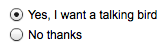
- Pros
- both choices are stated and visible
- Cons
- higher space consumption
One of Two
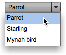
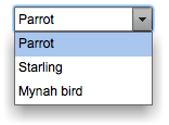
Two-choice drop-down list
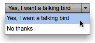
- Pros
- both choices are stated
- low and predictable space consumption
- easily expandable later to more than two choices
- Cons
- only one choice is visible at a time
- requires some dexterity
One of Two
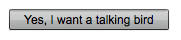
“Press-and-stick” toggle button
- Pros
- same as for checkbox
- when iconic, very low space consumption
- Cons
- same as for checkbox
- not as standard as a checkbox for text choices
One of N (N small)
N radio buttons

- Pros
- all choices are always visible
- Cons
- high space consumption
One of N (N small)
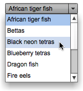
N-item drop-down list
- Pros
- low space consumption
- Cons
- only one choice is visible at a time (except when the menu is open)
- requires some dexterity
One of N (N small)
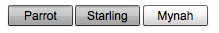
N-item set of mutually exclusive toggle buttons
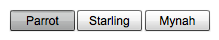
- Pros
- low space consumption
- all choices are visible
- Cons
- icons might be hard to understand
- user might not know they’re mutually exclusive
One of N (N small)
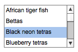
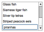
Single-selection list or table
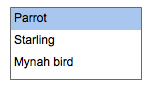
- Pros
- many choices are visible
- can be kept as small as three items
- Cons
- higher space consumption than drop-down list or spinner
One of N (N small)
Spinner
- Pros
- low space consumption
- Cons
- only one choice is ever visible at a time
- requires a lot of dexterity
- unfamiliar to naive computer users
- drop-down list is usually a better choice
One of N (N large)
N-item drop-down list (scrolled if necessary)
- Pros
- low space consumption
- Cons
- only one choice is visible at a time (when menu is closed)
- requires a lot of dexterity to scroll through items
One of N (N large)
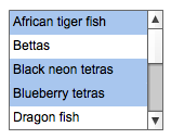
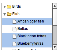
Single-selection list or table
- Pros
- many choices are visible
- can be kept small if needed
- Cons
- higher space consumption than drop-down list
One of N (N large)
Single-selection tree (w/categories)
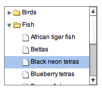
- Pros: many choices are visible; organization can help findability
- Cons: may be unfamiliar to naive computer users; high space consumption; requires high dexterity
One of N (N large)
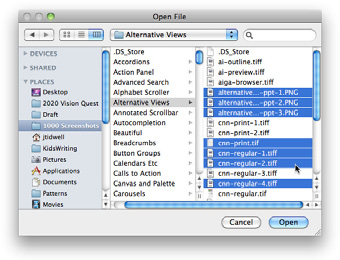
Custom browser
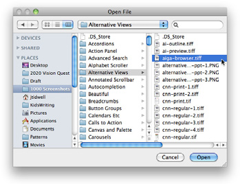
- Pros: suited for browsing available choices
- Cons: may be unfamiliar to some users; difficult to design; usually a separate window so it’s less immediate than controls placed directly on the page
Many of N
Array of N checkboxes

- Pros
- all choices are stated and visible
- Cons
- high space consumption
Many of N
Array of N toggle buttons
- Pros
- low space consumption
- all choices are visible
- Cons
- icons might be cryptic
- might look mutually exclusive
Many of N
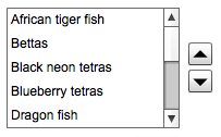
Multiple-selection list or table
- Pros
- many choices are visible
- can be kept small if needed
- Cons
- not all choices are visible without scrolling
- high (but bounded) space consumption
- user might not realize it’s multiple-selection
Many of N
List with checkbox items
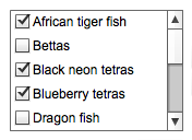
- Pros: many choices are visible; can be kept small if needed; affordance for selection is obvious
- Cons: not all choices are visible without scrolling; high (but bounded) space consumption
Many of N
Multiple-selection tree (w/categories)
- Pros: many choices are visible; organization helps findability in some cases
- Cons: may be unfamiliar to naive computer users; requires high dexterity; looks the same as single-selection tree
Many of N
Custom browser (such as for files, colors, or fonts)
- Pros: suited for browsing available choices
- Cons: may be unfamiliar to some users; difficult to design; usually a separate window so it’s less immediate than controls placed directly on the page
Many of N
List Builder pattern
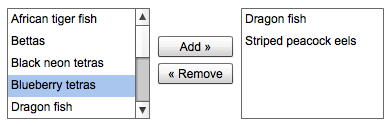
- Pros: selected set is easy to view; selection can be an ordered list if desired; easily handles a large source list
- Cons: very high space consumption due to two lists; does not easily handle a large set of selected objects
Unordered list of user items
List or table with Add or New button
- Pros
- “add” action is visible and obvious
- Cons
- higher space consumption
- visual clutter
Unordered list of user items
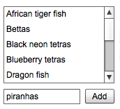
List or table with New-Item Row pattern
- Pros
- lower space consumption
- editing is done in place
- Cons
- “add” action is not quite as obvious as a button
Unordered list of user items
List or table receiving dragged-and-dropped items

- Pros
- visually elegant and space-saving
- drag-and-drop is efficient and intuitive
- Cons
- “add” action is not visible, so users may not know the list is a drop target
Ordered list of items
Unordered list with “up” and “down” affordances
- Pros
- rearrangement actions are visible
- Cons
- higher space consumption
Ordered list of items
Unordered list offering internal drag-and-drop
- Pros
- visually elegant and space-saving
- drag-and-drop is efficient and intuitive
- Cons
- rearrangement actions are not visible (so users may not know they’re available)
Single-line Text
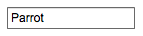
Single-line text field
For entering one line of text
Single-line Text
Combo box
For entering either one line of text or a one-of-N choice
- Pros: quicker to use than a separate dialog box; familiar
- Cons: limited number of items can reasonably fit in drop down
Single-line Text
Text field with More button or Dropdown Chooser
For entering either one line of text or a one-of-N choice
- Pros: permits the launch of a specialized chooser dialog box, e.g., a file finder or drop down
- Cons: not as familiar as a combo box to some users; dialogs are not as immediate
Multiline Text
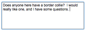
Text area
For entering multiple lines of unformatted text
Multiline Text
Text area with inline tags
For entering multiple lines of formatted text
- Pros: skilled users can avoid the toolbar by typing tags directly
- Cons: not truly WYSIWYG
Multiline Text
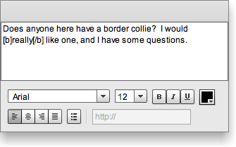
Rich-text editor
For entering multiple lines of formatted text
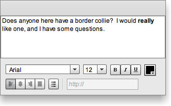
- Pros: immediacy, since the edited text serves as a preview
- Cons: use of toolbar is required, so it cannot always be keyboard only
Arbitrary type/format
Text field using Forgiving Format
- Pros: visually elegant; permits wide variety of formats or data types
- Cons: expected format is not evident from the control’s form, so it may cause temporary confusion; requires careful backend validation
Arbitrary type/format
Text field using Structured Format
- Pros: desired format evident from control’s form
- Cons: possibly higher space consumption; more visual complexity; does not permit any deviation from the specified format, even if user needs to do so; may be more difficult for assistive technologies than a single field
Arbitrary type/format
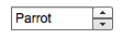
Spin box (best for integers or discrete steps)

- Pros: user can arrive at a value via mouse clicks, without touching the keyboard; can also type directly if desired
- Cons: not familiar to all users; you may need to hold down the button long enough to reach the desired value; requires dexterity to use tiny buttons
Bounded ranges
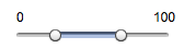
Slider
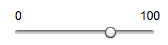
- Pros: obvious metaphor; position of value in range is shown visually; the user cannot enter a number outside the range
- Cons: high space consumption; unobvious keyboard access; tick labels can make it very crowded
Bounded ranges
Spinner

- Pros: values are constrained to be in range when buttons are used; low space consumption; supports both keyboard-only and mouse-only access
- Cons: not familiar to all users; requires dexterity to use tiny buttons; needs validation; cannot visually see value within range
Bounded ranges
Text field with error checking (can have Input Hints, Input Prompt, etc.)
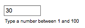
- Pros: familiar to everyone; low space consumption; keyboard access
- Cons: requires validation; no constraints on what can be entered, so you have to communicate the range by some other means
Bounded ranges
Slider with text field (can take the form of a Dropdown Chooser with a slider on the drop down)

- Pros: allows both visual and numeric forms of input
- Cons: complex; high space consumption when both elements are on the page; requires validation of text field when the user types the value
Subranges
Double slider (can be used with two text fields)
- Pros: lower space consumption than two sliders
- Cons: unfamiliar to most users; no keyboard access unless you also use text fields
Subranges
Two sliders (also can be used with text fields)
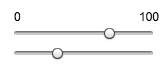
- Pros: less intimidating than a double slider
- Cons: high space consumption; no keyboard access unless text fields are used, too
Subranges
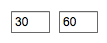
Two spinners (can be linked via Fill-in-the-Blanks)
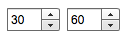
- Pros: values are constrained to be in range when buttons are used; low space consumption; supports both keyboard-only and mouse-only access
- Cons: not familiar to all users; requires dexterity to use tiny buttons; needs validation; cannot visually see value within range
Subranges
Two text fields with error checking (can use Input Hints, Input Prompt, or Fill-in-the-Blanks)
- Pros: familiar to everyone; much lower space consumption than sliders
- Cons: requires validation; no constraints on what can be entered, so you need to communicate the range by some other means
Date and Time
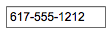
Text field with Forgiving Format
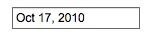
- Pros: visually simple; permits wide variety of formats or data types; keyboard access
- Cons: expected format not evident from control’s form, so it may cause brief confusion; requires careful backend validation
Date and Time
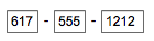
Text fields with Structured Format
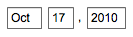
- Pros: desired format evident from control’s form
- Cons: possibly higher space consumption; more visual clutter; does not permit deviation from specified format, even if user wants to do so; may be more difficult for screen readers than a single field
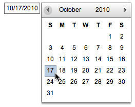
Date and Time
Calendar or clock control
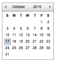
- Pros: obvious metaphor; input is constrained to allowable values
- Cons: high space consumption; may not provide keyboard-only access
Date and Time
Dropdown Chooser with calendar or clock control
- Pros: combines the advantages of text field and calendar control; low space consumption
- Cons: complex interaction; requires dexterity to pick values from a drop down
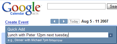
Forgiving Format
Permit users to enter text in a variety of formats and syntax, and make the application interpret it intelligently.

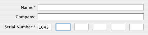
Structured Format
Instead of using one text field, use a set of text fields that reflect the structure of the requested data.
Fill-in-the-Blanks
Arrange one or more fields in the form of a sentence or phrase, with the fields as “blanks” to be filled in by the user.
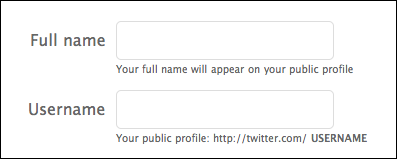
Input Hints
Place a phrase or example that explains what is required beside or below an empty text field.
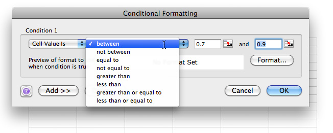
Input Prompt
Prefill a text field or drop down with a prompt that tells the user what to do or type.

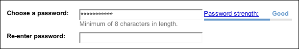
Password Strength Meter
Give the user immediate feedback on the validity and strength of a new password while it is being typed.
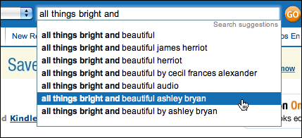
Autocompletion
Anticipate the possible answers as user types, show a selectable list of them; automatically complete the entry when appropriate.
Autocompletion
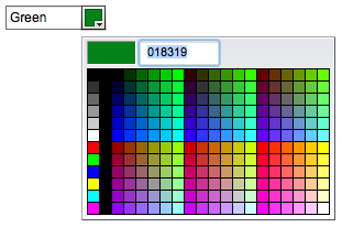
Dropdown Chooser
Extend the concept of a menu by using a drop-down or pop-up panel to contain a more complex value-selection UI.
List Builder
Show both the “source” and the “destination” lists on the same page; let the user move items between them, via buttons …
List Builder
… or drag-and-drop.
Good Defaults
Wherever appropriate, prefill form fields with your best guesses at the values the user wants.
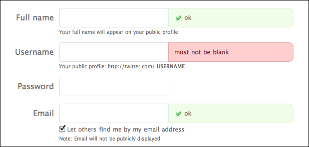
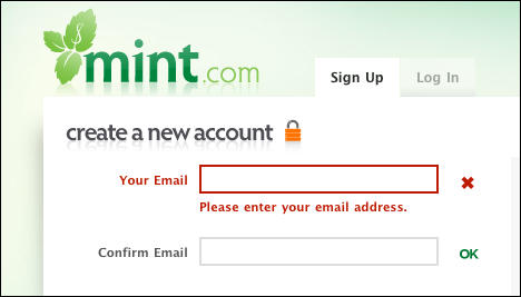
Same-Page Error Message
Place form error messages directly on the page with the form itself; mark the top of the page with an error message and/or put indicators next to the originating controls.
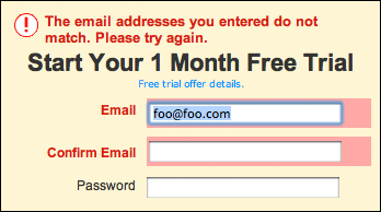
Same-Page Error Message