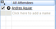
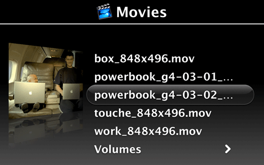
Two-Panel Selector
Put two side-by-side panels on the interface. In the first one, show a list of items that the user can select at will; in the second one, show the content of the selected item.
Two-Panel Selector
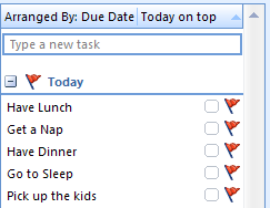
List Inlay
Show a list of items as rows in a column. When the user selects an item, open that item’s details in place, within the list itself. Allow items to be opened and closed independently of each other.
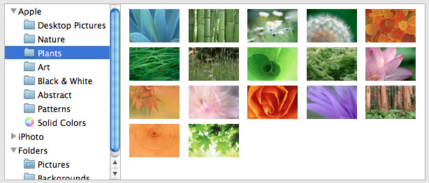
Thumbnail Grid
Arrange a list of visually interesting items into a “small multiples” grid of thumbnail images. Let the user select one or more thumbnails to view or manage those items.
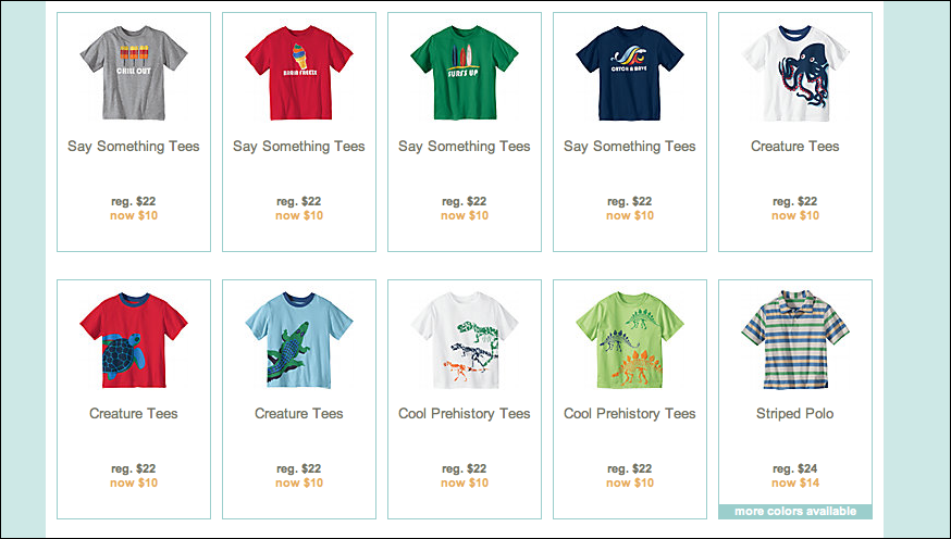
Thumbnail Grid
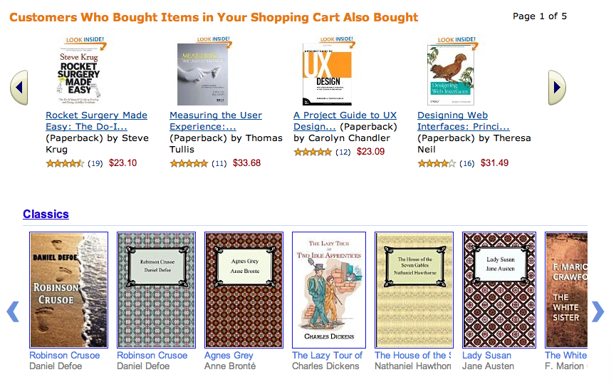
Carousel
Arrange a list of visually interesting items into a horizontal strip or arc, and let the user scroll or swipe the image thumbnails back and forth to view them. Enlarge the center item, if appropriate.

Carousel
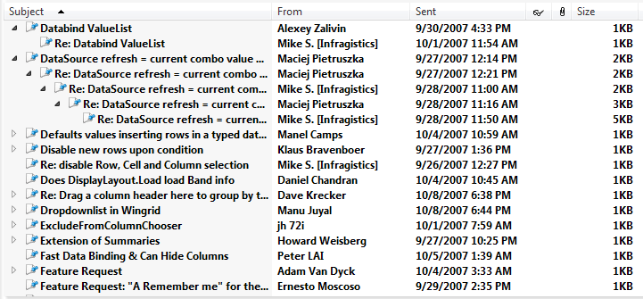
Row Striping
Use two similar shades to alternately color the backgrounds of the table rows.
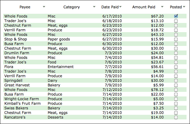
Row Striping
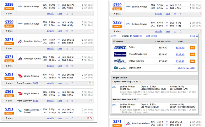
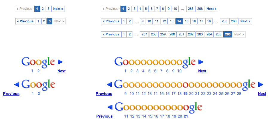
Pagination
Break up a very long list into pages, and load them one at a time. Provide controls for the user to navigate the list—next, previous, first, and last pages.

Pagination
Jump to Item
When the user types the name of an item into a table or tree, jump straight to that item and select it.
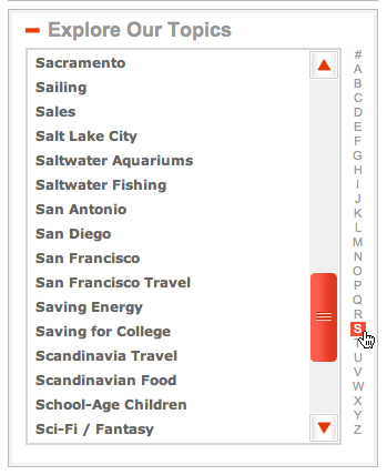
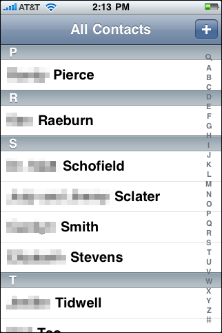
Alphabet Scroller
Show the letters of the alphabet arrayed along the scrollbar of an alphabetized list.
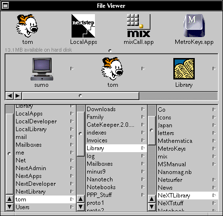
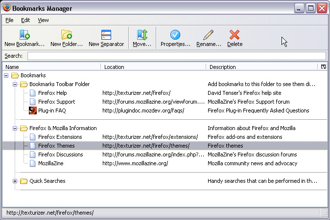
Cascading Lists
Express a hierarchy by showing selectable lists of the items in each hierarchy level. Selection of any item shows that item’s children in the next list.
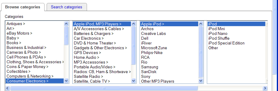
Cascading Lists
One-Window Drilldown
Show a list or menu of items in a single window. When the user selects an item from the list, show the details or contents of that item in the window, replacing the list.

One-Window Drilldown
Tree Table
Put item fields in table-like columns, but use an indented outline structure in the first column to illustrate the tree structure.
Tree Table
New-Item Row
Use the last or first row in the list or table to create a new item in place.